Principles of EIS
Since you’re reading this, you most likely know that as the name suggests, Electrochemical Impedance Spectroscopy (or just EIS, from now on) involves looking at the impedance characteristics of an electrochemical system over a range of frequencies (that’ll be the spectrum part). And maybe you’re thinking about trying your hand at some equivalent circuit fitting, which is the dark art process of fitting a spectrum you’ve measured to a model based on some real (and some not real) electrical components. But first, it’s important to understand some of the theory behind impedance itself.
Impedance vs resistance
Consider Ohm’s law, which describes the relationship of voltage to a direct current passing through a resistor:
$$E = IR \tag{1}$$Impedance is, very simply, extends the concept of resistance to an alternating current, and generally represented as $\pmb{Z}$. So you can think of it, simply, like this:
$$E = I\pmb{Z} \tag{2}$$We’ll come back to this in a moment. For now, it should be clear that a measurement of impedance, therefore, can be made by made simply by applying an oscillating voltage, and measuring the (oscillating) current response. We can write down an equation for the oscillating voltage we apply like so:
$$E(t) = \left|E\right|\sin(\omega t) \tag{3}$$where $\left|E\right|$ is the amplitude of the voltage signal, and $\omega = 2 \pi f$ (the angular frequency). The response will be a current with an amplitude $\left|I\right|$, which is also shifted in phase from the applied signal:
$$I(t) = \left|I\right|\sin(\omega t + \theta) \tag{4}$$The current is shifted in phase because of reactance (e.g., a capacitance or inductance) in addition to the resistance (which changes the amplitude). The impedance can therefore be expressed like this:
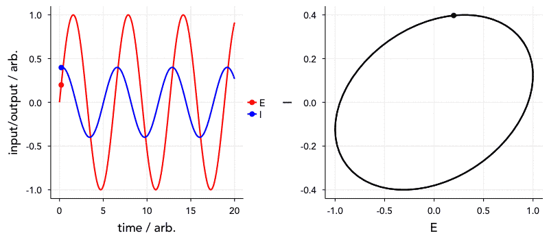
$$\pmb{Z} = \frac{E(t)}{I(t)} = \frac{|E| \sin(\omega t)}{|I| \sin(\omega t + \theta)} = |Z| \frac{\sin(\omega t)}{\sin(\omega t + \theta)} \tag{5}$$Have a look at the animation below. The ‘current’, I, is 72° out of phase with the ‘voltage’. The graph on the right is known as a Lissajous curve, showing the relationship between I and E. In the past, impedance spectroscopy was done by obtaining these curves on an oscilloscope and analysing them. Thankfully, it’s all a bit easier nowadays.
Impedance as a complex number
Ok, complex maths time. Without going into too much detail, via Euler’s formula:
$$e^{jx} = \cos(x) + j \sin(x) \tag{6}$$we can re-write all of the above using complex numbers:
$$ \pmb{Z} = \left|Z\right| e^{j\theta} = \frac{\left|E\right|e^{j \omega t}}{\left|I\right|e^{j \omega t + \theta}} \tag{7}$$or simply:
$$\pmb{E} = I \pmb{Z} = I\left|Z\right|e^{j \theta} \tag{8}$$Note that $j$ is the imaginary unit, i.e., $j = \sqrt{-1}$, which we use instead of $i$ to avoid confusion with the symbol for electrical current. You can see from the above equation that the ratio of an oscillating voltage to an oscillating current is the impedance, which has a magnitude $|Z|$ and a phase angle $\theta$. You can think of this as a polar coordinate representation. More commonly for impedance spectroscopy, however, we generally use the Cartesian complex plane representation, dividing the complex impedance into the real and imaginary parts:
$$\pmb{Z} = Z' + j Z'' \tag{9}$$$Z'$ and $Z''$ are the resistive and reactive parts of the impedance respectively. You’ll see this more clearly on the page about the impedance of simple RC circuits.
We can represent any $\pmb{Z}$ on an Argand diagram, as in the graph below. This is the basis for the Nyquist plot, which is the plot of the real and imaginary parts of the impedance that you’ll come across most often. An impedance measurement for a single frequency is a single point on a Nyquist plot. An impedance spectrum is therefore a series of points, where each point is a different frequency.

These plots are visually useful, because the characteristic shapes that can appear in the plots as you’ll see later can give you a rough idea of what you’re looking at. The downside, though, is that you can’t know what the frequency associated with a particular point is from looking at the Nyquist plot alone, and so the plot doesn’t contain all the information you need. This is why the alternative Bode plot – plots of $\log Z'$ and $\log Z''$ vs $\log f$, or $\log |Z|$ and $\theta$ vs $\log f$ – are still important.
Nyquist plot
I’ll finish up this page by briefly introducing a typical Nyquist representation of an impedance spectrum itself. The plot below is data I acquired from a Li-ion test battery, and fitted to a model myself. The frequency range the points represents is between 100 kHz and 100 mHz. This is fairly typical for most systems, although depending on what you want to measure you might go up to 1 MHz or more, or as low as 1 mHz. So how do you make sense of this plot? Well, there are three things I’ll note for now.
First, the impedance is always lowest (i.e., smallest values of $|Z|$ at the highest frequency, so you can see that the frequency decreases if we follow the curve from the points near the origin to the points in the top-right corner. Secondly, you’ll note (as in the Argand diagram above) that the values of $Z''$ are negative (plotted as $-Z''$). This will become clearer later, but by convention capacitance is a negative reactance, so impedance spectra will in most cases only have positive $Z’$ values and negative $Z''$ values.
Lastly, you’ll note the shape of the spectrum, particularly the semi-circle part. The shapes you see in the Nyquist plots can be characteristic of certain elements or combinations of elements, so they are (often, but not always) visually useful for quickly understanding something about the system you’re measuring. Because of this I was able to take this relatively good quality data, think of a reasonable model, guess a few of the parameters and then fit the entire spectrum relatively quickly. In the following pages you’ll read about the experimental technique I used to get this data as well as the elements of the model I’ve fitted the data to, and hopefully you’ll be able to see how it all fits together.

There’s a slightly nitpicky but formal stylistic point I like to make when I give lectures on this topic, and that’s about axis scaling on Nyquist plots. As you can see from my Argand diagram above, the axes are proportional (i.e., 2 units on the x-axis are equal in length to 2 units on the y-axis). Formally, it should be this way, because you can still read any point as a magnitude and a phase angle as well as the real and imaginary parts. Practically, it is still helpful to do this because it will let you see important features such as 45° lines easily. Unfortunately, most people who publish impedance results in the literature do not do this. To some extent, I sympathise, because common scientific graphing programs like Origin Pro do not make it easy to do this. But, most often the person making the graph goes to the effort to set the limits on the x- and y-axes to be the same, but keeps the plot itself the default rectangle, rather than resizing it to a square. This, I think, is just sloppy.
And as a final tip for R and ggplot2 users: it is thankfully trivial to ensure that axes are kept proportional. Just add coord_fixed to ggplot()!